
Designing a web page is not rocket science, but it is not easy either under constant pressure of commercial interests and attracting readers. Nielsen Norman Group, online user experience research and consultancy firm, has been a strong advocate of simple and highly usable design for many years. The company’s new study How People Read Online has some valuable information for designers.
The key thing that makes NNG (Nielsen Norman Group) usability study valuable is that they don’t ask users their opinions. Instead, they carefully study what people actually do when they surf the web and read pages.
For web designers, these studies provide a number of important results. For instance, how users move on a page, what attracts their attention and what makes them abandon a page altogether.
First, let’s take a look at the best way to throw people out of a page. It is simple. Insert an advertisement or another irrelevant section in the article body so that it breaks the flow of text and reading. Here is a sample image where two ads interrupt reading of the article completely. Goodbye web site!
Two web page designs have become common in recent years. Perhaps because they can keep eyeballs on the page: lawnmower pattern and pinball pattern.
Lawnmower pattern is a zigzag design where the placement of an image and respective text block alternate from left to right and from right to left for the entire page. Below is an example.
NNG’s study indicates that people tend to scan through a lawnmower pattern page pretty consistently. The order of viewing is from left to right, straight down and to the left, and repeat. It forms a pattern like someone was pushing a lawnmower on a yard.
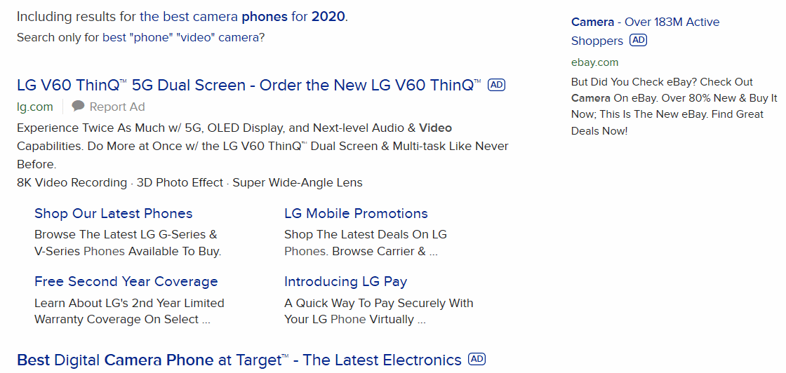
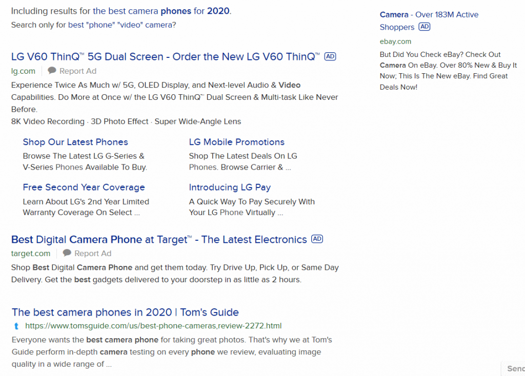
Search results page displayed by a search engine like Google, DuckDuckGo or Searx are a special case, but perhaps we can learn something from the way they have been designed. Many search engines display their results in a way that makes people view the page in pinball pattern.
The ads on the right draw attention as much as the top search results, causing a pinball effect of hopping back and forth between the results column and the ad column.
When people quickly scan a web page, the pattern resembles letter F. It was identified years ago in NNG’s usability tests. The most common way how people scan a web page is to start from the top left corner of the actual content, view the top lines, return to the left, and focus attention on something below the top lines. From there scanning continues towards the bottom of the page primarily on the left side of the content area.
This and many more points can be discovered in the NNG study.